
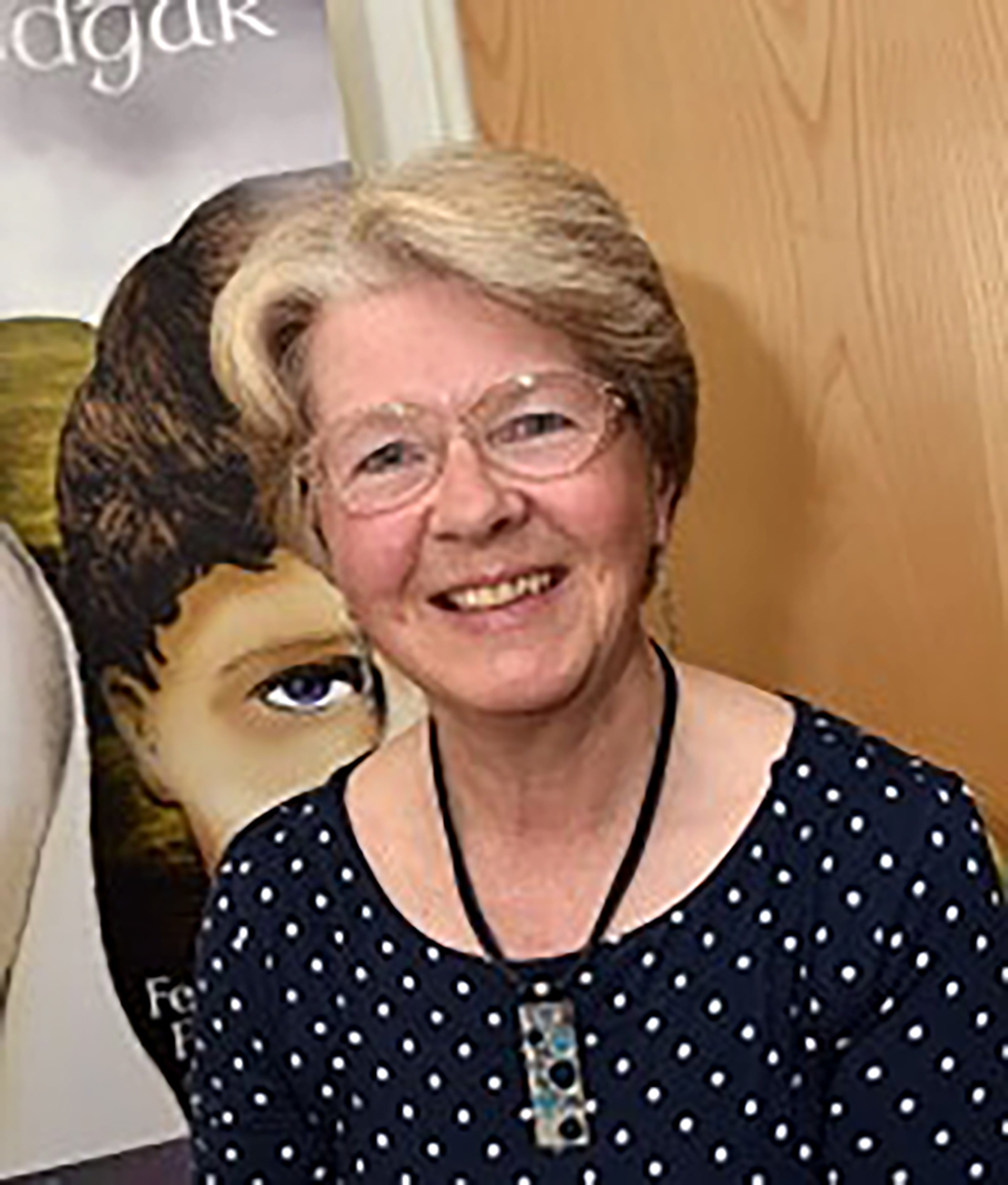
Author of Historical Fiction and Walking Guides for the West Midlands
By Heather Flack
Heather’s books are available on the ACW bookshop under her pen names Fenella Flack and Fen Flack.
To compete in the market with traditionally published books, we need to make our self-published books look as though they have been through the same process. The cover is vital, so, for novels, I have used a graphic designer who has a reservoir of illustrators, and she suggests an appropriate one. Getting the illustration right can be a painful process and the subject of much prayer, but once the illustration is in the hands of the graphic designer, it becomes something beautiful. In addition, the cover should have a bar code (free from terryburton.co.uk/barcodewriter/generator) and perhaps a logo, as well as the usual blurb, review comment and price. When writing a series, “branding” is important – the books need to look as though they belong together.
The inside should also look good. Too many self-published books use a small font size of print. I use Times New Roman 12, with decent but not excessive margins. Any maps also have to look professional; I use a free program called Inkscape. I also always use a professional proofreader.
For the walking books, I didn’t use a graphic designer. My own photos are on the front and the back, and my printer can do the finishing touches with title, author, etc. They are spiral-bound for ease of use when out walking, and the books are small enough to go in an anorak pocket.
Think about the size. What size are other novels or books in the same genre? How will it fit on a shelf? How thick is it? “Ironside” has 284 pp and posts as a large letter. The sequel “Edward the Exile” has 382 pp and is too fat to be a large letter and has to go as a parcel. I found that out too late.
To help with marketing, I have a website, which is www.flackbooks.weebly.com. Weebly offers a free website if its name is left in the title.

